JE Safety
A website solution that allows construction workers and managers to maintain health and safety standards in the workplace.
Overview
The Challenge │ Improve and optimize the user experience of the current JE Safety website by improving the usability.
The Product │ JE Safety and Environmental Consulting is a company offering solutions for construction worksite safety adherence through online training courses. With JE Safety's website, users are able to learn more about consulting services, book appointments and register for online trainings.
My Role │ Usability Consultant
Methods │ UX / Usability Audit and Assessment
The Challenge
The client, JE Safety, had a current website built with Wordpress and was interested in having the website optimized for better usability. The client understood the need for an enhanced user experience of the website to retain and grow his online customer engagement.
As the usability consultant on this project, I started my process by understanding both the business goals and the target user goals by conducting stakeholder interviews and user empathy building. I did this to gather insights and gain a clear overall picture of the business and user needs.
Website Usability Assessment
Once I had a high level understanding of the business goals and user needs, I began my assessment. I then compiled my assessment findings into a summary so that the business stakeholder/owner could review easily and share with the development team.
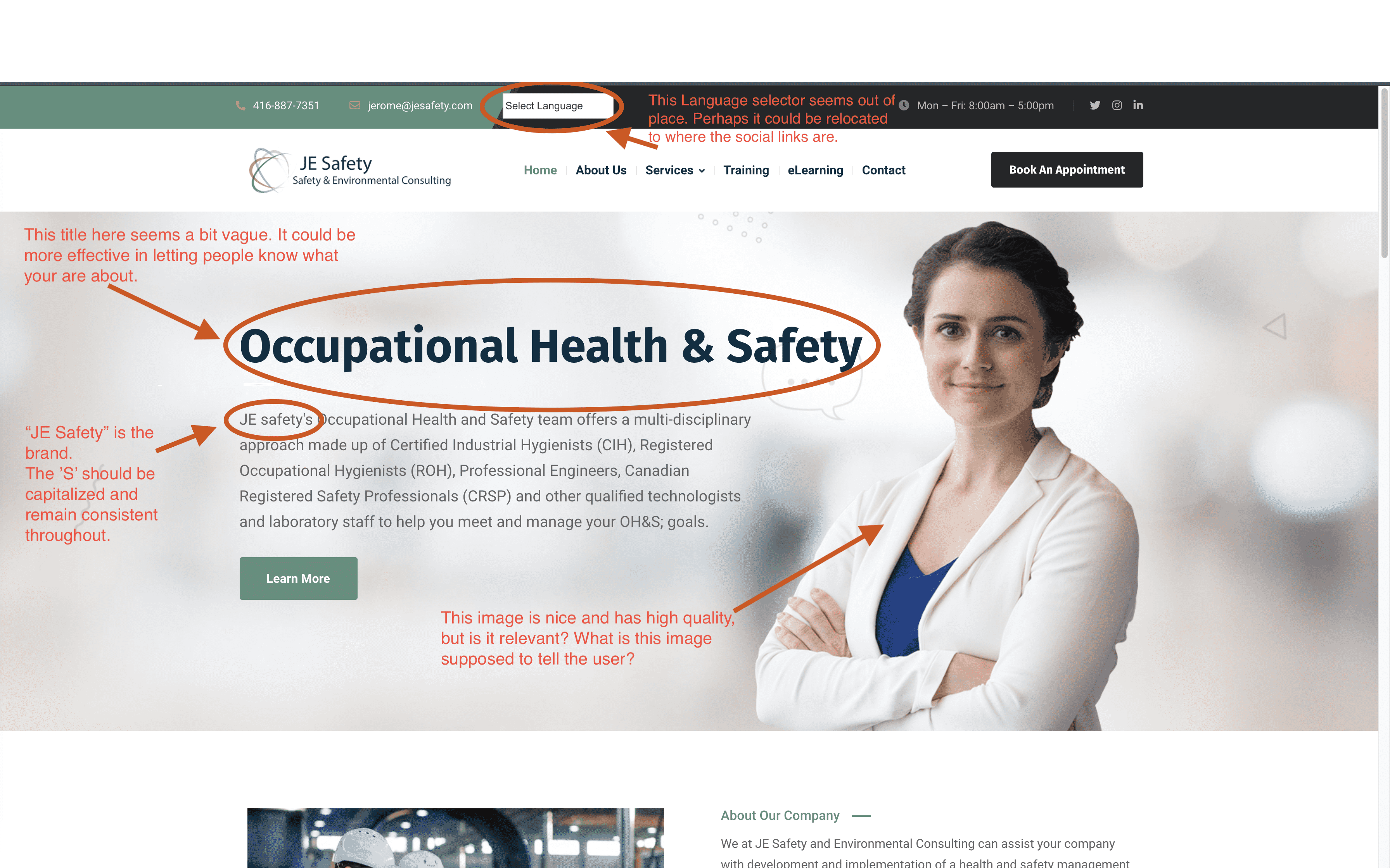
I included screenshots and annotations to help visually highlight some the pain points that I discovered in the business website.

Detailed Annotations & Solutions
Below you can see the highlighted concerns that I communicated to the business and the development team, as well as the resulting solutions that came out of my usability consulting advise.
I was happy to use this opportunity to connect with the developers and I appreciated that this guidance was well received and prioritized for the sake of the users and the business objectives.
Home / Landing Page

The major concerns that I had with the home landing page was the lack of effective communication to deliver the company's purpose.
This is an issue because it's the first impression that the users will get from the site and it should be easy for them to determine what the company or site is offering without too much thought.
An example of this is the hero image. Is this image showing a doctor, a pharmacist or lab technician? None of those have to do with construction workers, which is currently the company’s target sector.
Other concerns were the placement of the language selector, some of the written content and brand consistency.
Improvements

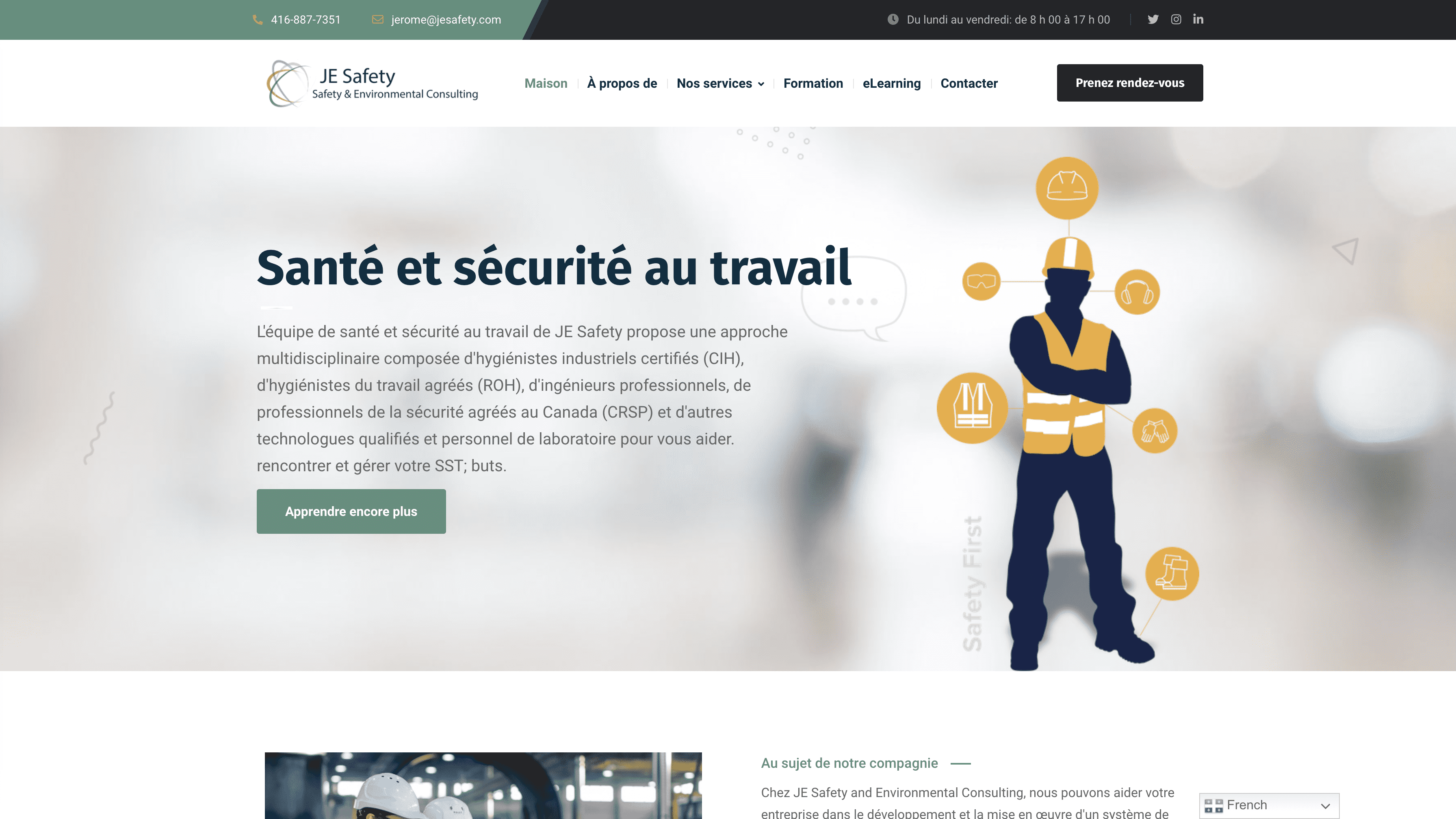
The home page was improved by changing the hero image to be more effective in communicating what the company focuses on, which is health and safety in the construction field.
Some other improvements are the placement of the language selector. It is now placed statically in the lower right hand corner of the screen where users can select a language from a drop down menu.
French Language Version

There was a high level usability issue with the French version of the website. When users change the language of the site to French with the language selector, the website's top navigation breaks and is hard to read with the overlapping page title. If users can’t see the navigation, it will be difficult for them to use.
I also noted the inconsistencies with the spacing between the CTA button and the first block of text on the page.
Improvements

French version of the website was fixed so that the top page navigation doesn’t break and is consistent with the other language versions of the website. The user can now navigate the site without any usability issues.
Accessibility

Here is another usability and accessibility issue. The button color and the button text color are not effective choices. This combination decreases the readability of the button and in turn affects the accessibility for those with visual impairments. I considered this another high level usability concern.
Improvements

The button text was changed to a white color to increase the contrast between the text and the button color. This improvement increases the readability of the text on the button.
Article Pages

For the article pages on the website, I pointed out that the text layout was very dense and that it hurt the overall readability. I suggested restructuring and spacing out the text.
Improvements

To improve the readability of the text on the article pages, the text was spaced out to reduce the density of the text.
Additional Screenshots with Annotations


Take Aways
.png)
As the usability expert invited on the JE Safety team, I wanted to ensure that the website experience for users was easier to utilize by improving communication and information structure, site consistency and accessibility. For the most part I feel that the improvements made on the site help to accomplish those goals and tie in to a better communicated purpose from the business.
Given that the business has the appropriate budget, the next thing I would suggest is to run some user testing studies to examine the effectiveness of the new site changes. Those insights gained from the studies would be great to look at to continue to iterate and improve upon the design and usability of the JE Safety website.


